


This year I'm trying my hand at the Umbrella Prints Trimmings Competition. I love their textiles, and I think it's a great way to encourage a waste-nothing mentality (if only I was so conscientious with my own scraps - I guess that'll be another project!)
I bought two trimmings packets and was planning on combining them, but when I opened them up and looked at the prints and colors I decided on two projects. Here's the progress on my project with the Dark trimmings pack. I decided to make a mini quilt based on the Converging Corners Tutorial by Film in the Fridge. I'm going to call it Broken Umbrella, because I couldn't remember the more positive sounding 'converging corners', and could only think of 'broken cabin' when I was trying to remember what this tutorial was called (ha!)
I bought two trimmings packets and was planning on combining them, but when I opened them up and looked at the prints and colors I decided on two projects. Here's the progress on my project with the Dark trimmings pack. I decided to make a mini quilt based on the Converging Corners Tutorial by Film in the Fridge. I'm going to call it Broken Umbrella, because I couldn't remember the more positive sounding 'converging corners', and could only think of 'broken cabin' when I was trying to remember what this tutorial was called (ha!)
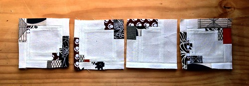 |
| Some of my favorites. One of my favorite prints of all time is the one in the upper right of the right block/upper left of the left block. |
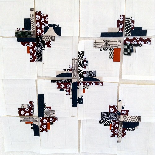 |
| What I envisioned as I made the blocks. |
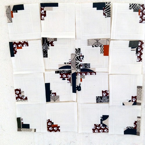 |
| Playing around with the layout 1. |
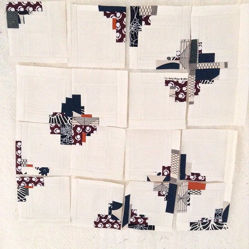 |
| Playing around with the layout 2. |
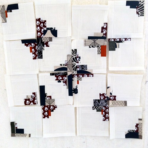 |
| Playing around with the layout 3. |
I haven't sewn them all together yet, but I think I know which layout I'm going to choose...which one do you like the most? I've got to get this finished up soon so I can throw it into the ring as a contender by May 30th!
Linking up with Lee at Freshly Pieced WiP Wednesday.
I like the first and last layouts best but not sure which of those two I would decide on. It looks really striking and eye catching. A really pleasing use of black and white colour combination.
ReplyDeleteMakes me want to give the pattern a go myself. Thanks for sharing.
These are lovely blocks! I love the layout 3.
ReplyDeleteI like layout 1 - most pleasing to the eye.
ReplyDeleteI really like layout 1, but all the combinations are interesting. It is fun to try out different options and how often what we have in our heads isn't what we end up liking the most!
ReplyDeleteI like them all, but layout one is my favorite, but something about layout 3 calls to me. I think because with those corner blocks turned, it isn't quite "perfect" but so cool at the same time. Hope that makes some sense.
ReplyDeleteI real like the look of layout 3!I like how it's different with only the three corners.
ReplyDeleteMy vote is for number 2! Guess I'm my own on this one!
ReplyDeleteI like the second and the last! You are definitely going to be a contender, these blocks are great so far :)
ReplyDeleteI was trying to remember what this tutorial was called (ha!)travel umbrella
ReplyDelete